The colors of fall 2017 as seen in our rugs and on the runway
Every spring and fall, the team at the Pantone Color Institute — the global authority on color and provider of color standards for the design industries — examines which colors were repeatedly seen within designers’ collections during New York Fashion Week.
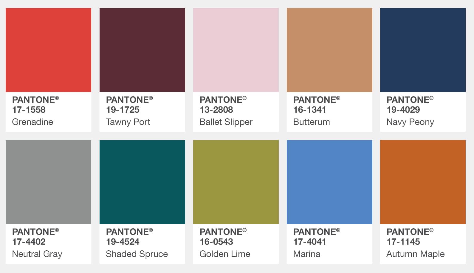
As we sit on the brink of fall, we thought we’d revisit several of the hues that Pantone predicted to be huge by the time the end of 2017 rolls around. Among them are Butterrum, Grenadine, Shaded Spruce, Neutral Grey, and Lapis Blue. And you guessed it — we paired one of our very own rugs with each below.
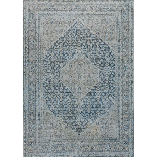
A Tabriz featuring PANTONE 16-1341 Butterrum
This snug, warming, and toasty shade is evocative of drinking a glass of Butterrum by a roaring fire on a cool autumn evening.
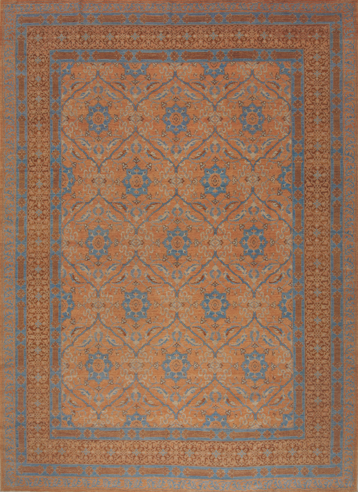
TABRIZ RUG
- 19602HM
- 12' 8'' x 17' 5''
A Tibetan featuring PANTONE 17-4402 Neutral Gray
The standard bearer of all neutrals, Neutral Gray shares the anchoring role with Navy Peony in this palette. It can be used as an accent or a head-to-toe statement shade.
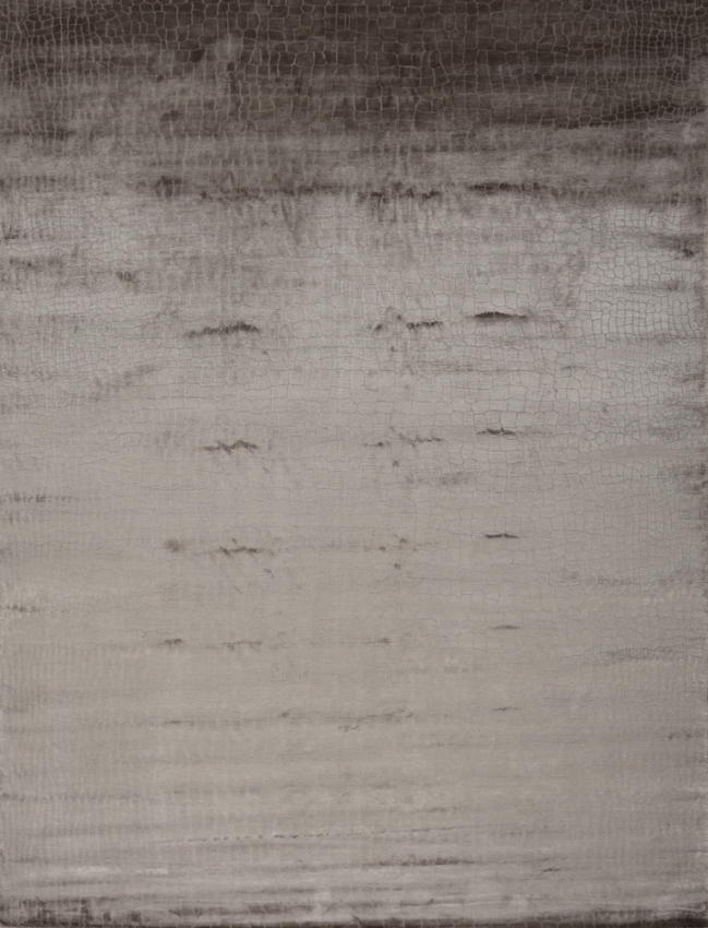
TIBETAN, ARMANI / CASA RUG
- 19667HM
- 9' 10'' x 13' 1''
An antique Malayar featuring PANTONE 19-4524 Shaded Spruce
This is a green you might see in the forest – sheltering and protective as evergreen trees.
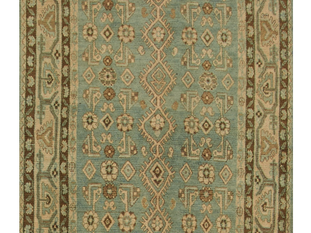
ANTIQUE MALAYER RUG
- 20707HM
- 3' 7'' x 18' 0''
A silk Sari featuring PANTONE 19-4029 Navy Peony
A mainstay for the season for both palettes, Navy Peony is a dependable and an anchoring shade. Solid and stable, the hue takes some of the load off of black as a go-to neutral.
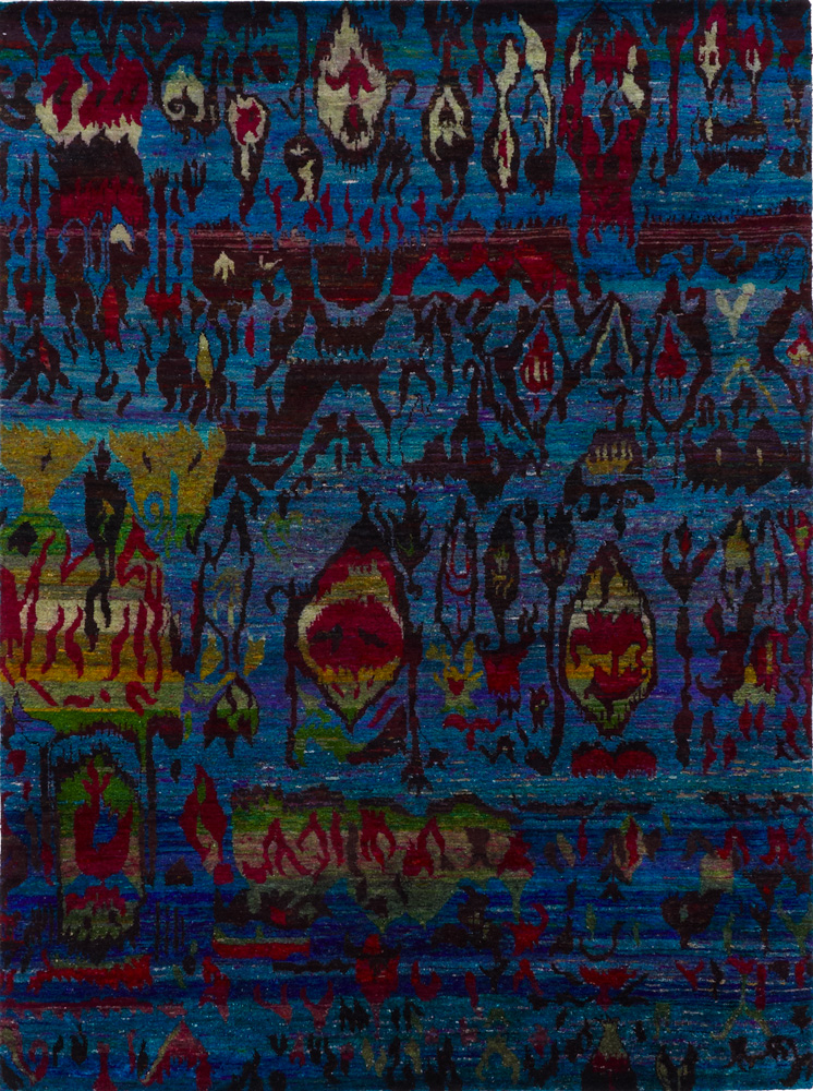
SARI SILK RUG
- 17499HM
- 7' 11'' x 10' 7''
A contemporary Scandinavian featuring PANTONE 17-1558 Grenadine
A powerful, evocative, dynamic red, Grenadine is a confident and self-assured attention-getter.
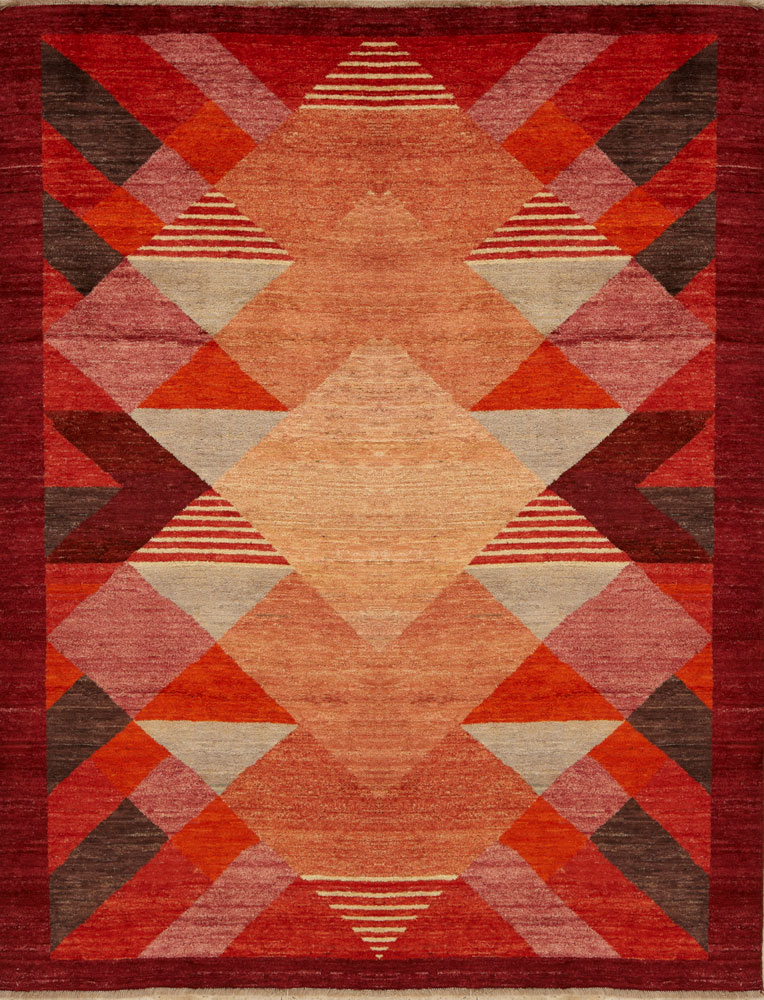
SCANDINAVIAN RUG
- 20190HM
- 9' 2'' x 11' 8''
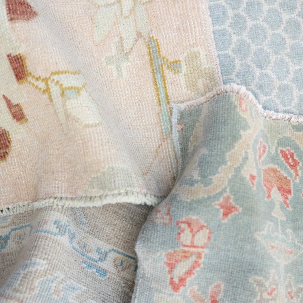
An antique Turkish Oushak featuring PANTONE 13-2808 Ballet Slipper
Descended from the Red family but with a softer touch, Ballet Slipper is always flattering and reminiscent of the rosy glow of health.
Visit the full Fall 2017 color report.
You cart is empty. Shop now